I’m Tejas Hingu, a full stack developer, and I got a report of a button not working on mobile in a client’s web app. People on Android and iPhone couldn’t submit a form inside a modal. On desktop it worked every time, which is usually the first clue.
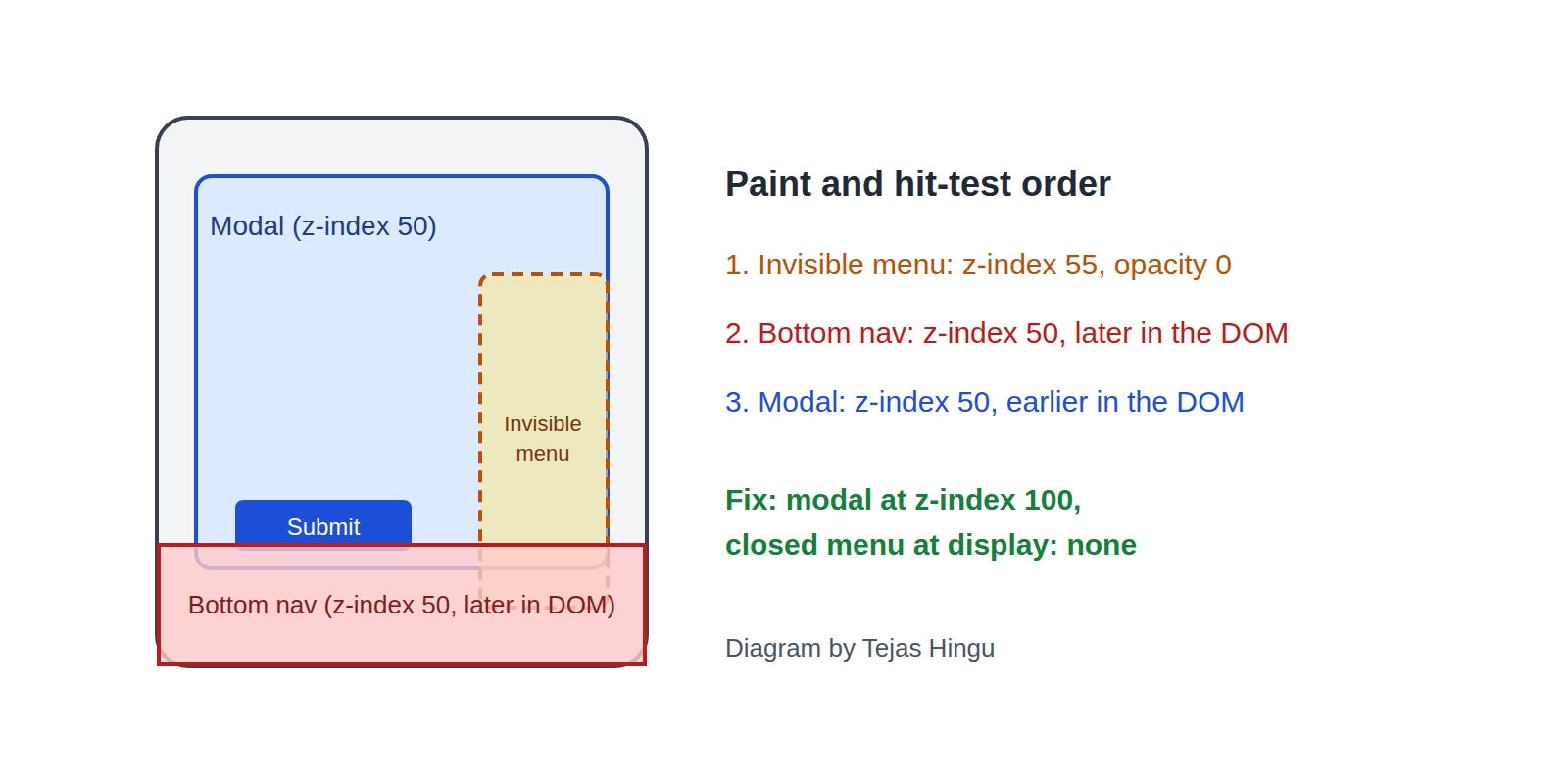
When a button works on desktop and does nothing on a phone, the button is rarely broken. Something else is sitting on top of it and taking the tap. In my case there were two culprits, and one of them was completely invisible.
How do you find what’s blocking the button?
Ask the browser. Connect your phone to DevTools with remote debugging and run this with the coordinates of the spot you tapped:
document.elementFromPoint(x, y);It returns whatever is really at that point, and it doesn’t care if that element is invisible. If you get back something other than your button, you’ve found the problem.
Why does the bottom navigation cover my modal?
The modal and the mobile bottom navigation both had z-index: 50. When two elements tie, the one later in the HTML paints on top, and the navigation came later. So on a phone it sat right over the modal’s buttons.
The fix was to raise the modal to z-index: 100, which the other modals in the app were already using. If your z-index looks right and still loses, check whether a parent uses transform, filter, or opacity. Those create a new stacking context, and your z-index only counts inside it.
Why can you still tap an element with opacity 0?
This was the sneaky one. A floating action menu kept its closed items at opacity: 0. Opacity only changes how something looks. The element still takes up space and still catches taps, so there was an invisible column about 180px tall sitting over every page.
On Android, it covered a date field in the form, so that field wouldn’t even open.
How do you hide a menu properly and keep the animation?
display: none removes the element completely, which is what you want. The catch is that an element coming back from display: none has nothing to animate from, so it just pops in.
I got around that by splitting the state in two. One value controls whether the menu exists on the page, and the other controls whether it’s expanded:
const [open, setOpen] = useState(false);
const [rendered, setRendered] = useState(false);
const [expanded, setExpanded] = useState(false);
const CLOSE_ANIMATION_MS = 320;

useEffect(() => {
  if (open) {
    setRendered(true);
    let inner;
    const outer = requestAnimationFrame(() => {
      inner = requestAnimationFrame(() => setExpanded(true));
    });
    return () => {
      cancelAnimationFrame(outer);
      cancelAnimationFrame(inner);
    };
  }
  setExpanded(false);
  const timer = setTimeout(() => setRendered(false), CLOSE_ANIMATION_MS);
  return () => clearTimeout(timer);
}, [open]);
When it opens, the menu goes on the page first and paints one collapsed frame, so the animation has somewhere to start. When it closes, the animation plays and then the timeout takes it off the page. I also added pointer-events: none for those few milliseconds while it’s closing.
What’s the fix for 100vh on mobile?
There was one more thing making this worse. On phones, 100vh is the height of the screen with the address bar hidden, so it can be taller than what you can actually see. My modal was centering itself in that taller box, which pushed its buttons down toward the navigation.
Switching to 100dvh fixed it, because dvh follows the space that’s really visible as the address bar moves. In Tailwind that’s min-h-dvh instead of min-h-screen.
Frequently asked questions
Why would a React button not work on mobile?
If the onClick works on desktop, React is probably fine. Check for an overlapping element first with elementFromPoint.
Why does my HTML button work on desktop but not on iPhone?
Same first step. After that, look for a fixed header or footer overlapping it, and for a leftover overlay from a closed menu or cookie banner.
Is pointer-events: none enough by itself?
It stops the element catching taps, but the element still takes up space. I used display: none once the menu was closed and only needed pointer-events: none during the closing animation.
Why did I need two requestAnimationFrame calls?
The first one fires before the browser has painted the newly shown element. The second fires after that paint, so the transition has a collapsed frame to start from.
Be First to Comment